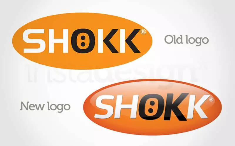
Back in 2008, I oversaw the re-branding of youth activity company, Shokk Ltd. They had developed their brand quickly, outsourcing design work to various different companies and freelancers. I set up an in-house team together with the talented Rob Clowes and Paul Williams, and over a period of four months planned and executed a full re-brand of the company.
As a team, we recognised the importance of addressing the ‘voice’ of the company as well as the visual language, and we proposed a change of the tag-line from ‘The Youth Fitness Specialists’ to “The Youth Activity People” giving a much more personal feeling. A re-brand is much more than just a revamped logo – it’s about looking at every aspect of an organisation’s communications with clients, customers and the outside world in general. The bulk of the work went into creating a Brand Bible, in which rules and guidelines were set out regarding every aspect of the new improved brand.
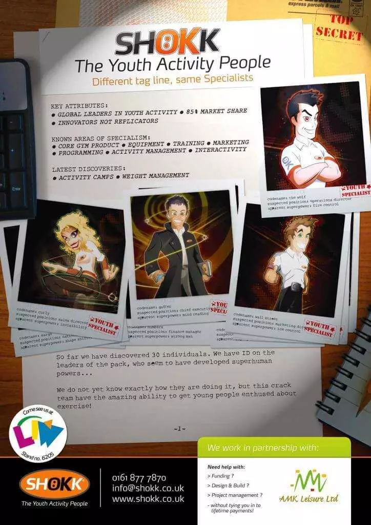
To launch the re-brand of Shokk Ltd. I created skeumorphic artwork based on the theme of detective work (featuring character illustration by Paul Williams) which was used by the company as a full page advert in trade press as well as direct marketing.